Recently, Danh Tran of the web-based real estate company Trulia (acquired earlier this year by Zillow) reached out to me with an interesting map. It showed noise complaints across San Francisco for 2010-2013 as an animation. Would I care to share it with our readers?
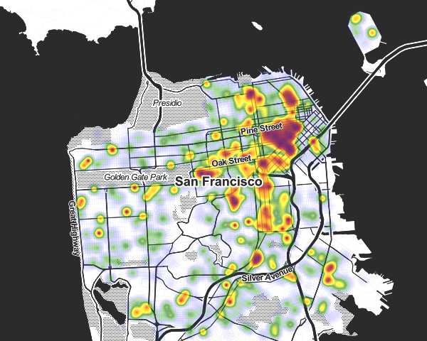
This is a screenshot for December 2013, the latest data they have. What this shows is where people call the police to complain about noise. The color coding is self-evident – green shades to yellow shades to red as the density of noise complaints rises.
The animation is available at this link on the Trulia website. It starts with Feb 2010 and cycles to December 2013 and back.
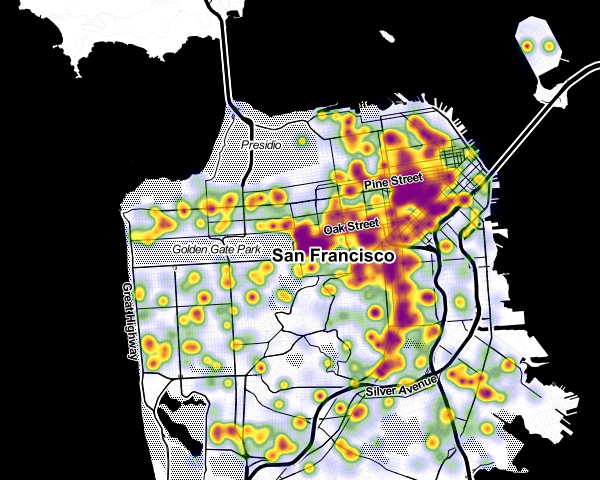
San Francisco’s noise complaint levels vary a lot: Here’s a screen-shot from October 2013. There’s a lot more red in this one!
Trulia’s Peter Black has made a similar analysis of several cities, including New York and Seattle. But the methodology he’s used for San Francisco is slightly different.
Why does San Francisco only have data through 2013? I asked. Simply – it looks like no one is compiling the data any more. Or if they are, it’s not easily available.
“In regards to the date, the reason for that is Peter couldn’t find any data for SF from the normal, open sources (311 calls) like he did for NYC and Seattle. Instead, he pulled it from our (Trulia) crime database. Unfortunately, and for no known explained reason, the noise complaints simply disappear from the data in 2014.”
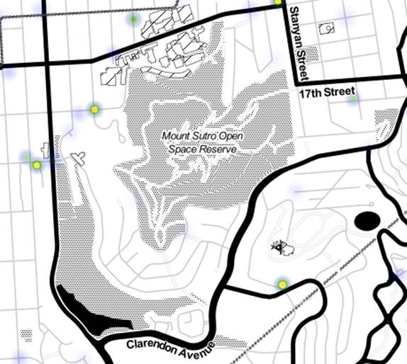
Regardless, the data clearly show what we know already: We live in a tranquil neighborhood. Here’s the [December 2013] noise complaints map for Forest Knolls (thanks, Danh Tran). Not a spot of red in sight.